
Our Blog

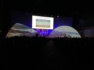
Event apps have gained in popularity over the past few years. Event planners are using mobile apps to automate and modernize many functions that have traditionally been done in a manual, paper-based way. Numerous developers and start-ups have launched mobile event apps and they are growing and improving at a rapid pace. The industry is now maturing and even though there are many players, the leaders are rising to the top.
In a world where “going green” is a major consideration for companies large and small, the event app makes a lot of sense. The biggest advantages of using an event app are to reduce paper and waste and to provide more timely information. Printed programs and signage can change multiple times and are often outdated before they are printed. Apps are also replacing most forms of written communications for delegates and attendees. We are also in a world where immediate, up-to-date information is expected to be available at a touch of a button so event planners are jumping onboard.
Let’s take a look at some of the ways a mobile event app can modernize your next event starting with registration. Apps aren’t intended to replace registration software but most are able to pull information from the reg software into the event app. This way all the attendees can be listed on the app and shared with other attendees. This is perfect for networking and figuring out who’s who in an organization. You can even upload a picture of every attendee or let the attendees do that themselves by customizing their own profile and adding additional contact info, a personal bio, and other pertinent information.
The most important document any attendee needs is the event agenda…where to go and when. The mobile app enables planners to keep the agenda completely up-to-date at all times and it goes a step further. It can show attendees exactly what room to go to and bring up a venue floor plan to guide attendees to the right place.
What if you make a change at the last minute? Say you have to move breakfast from one room to another. You can send out a push notification directly to the mobile device of every attendee, alerting delegates of the change. Want to see the bio of a keynote speaker? Go to the agenda and click on the name of the presenter and their bio can come up directly on your phone. Maybe you want to do that in reverse. Maybe there is a keynote presentation you don’t want to miss. Click on the presenter’s bio and the app will tell you exactly where and when they are speaking. Take it a step further by creating your own personal agenda. Every attendee can select the sessions they want to see and put them in their own personalized agenda that sends them notifications when their selected agenda items are about to start.
The features and applications are endless and for the most part, limited only by your imagination. There is live polling, analytics, a city guide, a place to download pertinent event documents, social media integration, photo gallery, the list goes on. You can even have a scrolling list of event sponsor ads to help monetize the cost.
Many app developers require companies to make a large investment to license their own custom app for enterprise use while other developers license container apps to resellers who can then personalize and brand the app for their specific end clients.
AV Strategies has partnered with Touchpoint®, one of the industry’s leading Event App developers. As a licensed partner of Touchpoint®, we can create and deliver customized Touchpoint® event applications. Our app provides cutting edge experiences for attendees by providing valuable, meaningful, and timely event information and delivers a richer event experience for attendees while providing detailed analytics and insights for event planners.
We can do all of this in a way that conforms to your company brand including your logo, colours, and company graphics. Clients can choose which features they want to use and which ones are not required. AV Strategies then builds out your own personalize app that meets your exact requirements. And because we are a licensed reseller there is no need for our clients to purchase their own enterprise license. We have done that for you and can in-turn, provide our clients with their own personalized event app.
With a simple download from either iTunes or Google Play, attendees can enjoy all of the features we have mentioned. The app also allows organizers to deliver videos and text welcome message, send out important event updates, and more. You can even use it to start promoting the event and grow engagement in the weeks leading up to the start of your meeting. The app is supported on all Apple and Android devices and on any other devices through a mobile web version. To find out more about our event app solution visit our website or download our info sheet with pricing.

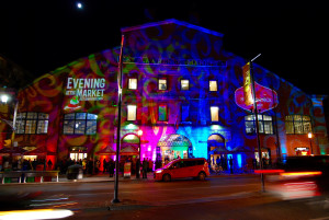 Rollin’ out the Red Carpet at the St. Lawrence Market
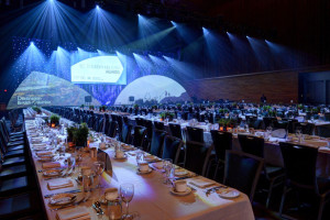
St. Lawrence Market is a piece of Toronto history. Since 1903 the Market has been a culinary focal point in the city. Earlier this month, AV Strategies partnered with Rob Laughlin of 6degrees to help execute audiovisual and production services for the sold-out, “Evening at the Market” event, where merchants came together to showcase some of their best and most extravagant culinary delights.
The City of Toronto engaged 6degrees and our AVS team to literally roll out the red carpet by installing 500 square feet of red carpet to welcome the 2,000 guests. We also lit the front façade of the building with animated colour logos and a wash of moving coloured light patterns.
 Inside, we provided audio and lighting for the DJ, jazz band, and aerial performers who were suspended from the ceiling on silks and large hoops. We also installed 5, very large, decorative chandeliers and a zoned PA system to deliver audio throughout both levels of the venue.
Our AVS Toronto team of, Antoine Lebrun, Majd Arkilo, and branch manager, Adam Hughes were amongst the crew on hand to ensure the event ran smoothly. We are extremely proud to have been involved in this very successful event at one of Toronto’s most iconic venues.
Resolution of Image Files
Many people don’t understand resolution and how it affects image quality and file size. Often I have needed a logo or photograph for a client’s project and they have downloaded or grabbed it from the Web. While high-resolution images can be found on the Web, grabbing an image directly from a Website usually results in capturing a low-res image that is unusable for other applications. Let’s talk about resolution and how to know the resolution of a given image.
Resolution refers to the number of pixels in an image. Resolution is represented by the width and height of the image as well as the total number of pixels. For example, an image that is 1920 pixels wide and 1080 pixels high (1920×1080) contains 2,073,600 pixels (or 2.1 Megapixels). Megapixels is usually how a camera’s resolution is measured while images that we work with on our computer are usually referred to by the pixel width and height. Your computer screen is set at a particular resolution. The larger the screen, the larger you likely have your screen resolution set. Many screens today have a native resolution of 1920×1080, which is the same resolution of an HD television. Now, if your monitor is set to 1920×1080 and you open up an image that is 640X480, it will only fill up a part of your screen. If you scale the image to fit your screen it will start to lose quality because you are stretching the pixels. If you open up an image that is 2400×1350 then the image will be larger than your screen size and you would have to scale it down to fit.
There is one other measure we should talk about. That is the dpi or dots per inch. DPI is much less important than resolution. The main things to know about dpi is that if an image is going to be shown on-screen like in a PowerPoint presentation or on a Website then your image doesn’t need to be any larger than 72 dpi. Images that you intend to print should have a dpi of 300 or greater. If you are making changes to a photograph that you intend to print then you will need to ensure your image is set to 300 dpi in your photo editing software. An image set to 300 dpi makes the file size much larger so if your image is for use on-screen then reduce the dpi to 72 and the file size will be significantly smaller.
I have found that many people who are not familiar with using image editing programs don’t know how to tell the resolution of an image. Many people will ask what file size an image needs to be to be usable in a PowerPoint presentation. The reason why the file size in not a good indication of image quality is because an image that is 1920×1080 and 72 dpi will have a much smaller file size than the same size image at 300 dpi. Likewise, a 1920×1080 tiff could have a file size that is 10 times larger than 1920×1080 jpeg. The best way to tell the size of an image is to open it in Windows Photo Viewer or Windows Live Photo Gallery and right-click on the image and select [Properties]. The Info Panel will show the pixel size and dpi of the image. On a Mac you can view the image in Preview and select [Show Inspector] from the Tools menu.
I hope this blog series has helped you to understand the various image file formats and how resolution affects image quality. Many articles on the subject can be found online for those who want to read more detail on the subject.
File Formats and How They are Used
In my last blog post, I explained the difference between Vector and Raster images. This post is dedicated to explaining the most common file formats and how they are used and why to choose one format over another. Basically, all image formats are different ways of compressing an image so that the file size of the image is manageable. The trick is to compress the image so that its file size is low while retaining as much quality of the original image as possible.
There are two types of image compression; “lossy” and “lossless”. Lossless compression discards no information so it looks for efficient ways to represent an image without making compromises in its accuracy. Lossy compression formats accept some degradation in the image in order to achieve smaller file size. While the number of compression formats seems endless, some formats you may be familiar with are JPEG, TIFF, PNG, GIF, BMP, or RAW. Here are some of the attributes of the most common formats:
Bitmap (.bmp)
- A common image format in Windows programs
- Good for printing images
- No loss in quality
- Millions of colours
- Large File Size
- May not be recognized in other operating systems
TIFF – Tagged Image File Format (.tif)
- An image format recognized by most computer systems.
- Preferred by many professional printers due to its high quality.
- No loss in quality
- Millions of colours
- Supports transparency (Alpha Channel)
- Can be used in various operating systems: Windows, Mac, and Linux
- Large File Size
- Not compatible with all windows applications
JPEG – Joint Photographic Experts Group (.jpg .jpeg)
- The most common image format for use on the Web and in digital cameras.
- Small file sizes
- Information discarded is often not visible to the human eye.
- When a saving as a JPEG, most editing programs allow the choice of compression ratio. More compression = smaller file size but poorer image quality.
- Millions of colours
- Recognized by most computers and most applications
- Format used by many digital cameras
- Common format for pictures in websites
- Some loss in quality
- Does not support transparency
- Doesn’t look as good when used in professional quality printing
GIF – Graphic Interchange Format (.gif)
- The first image format to be used on the Web, GIFs are good for images with a limited number of colours, such as logos, graphs, and drawings, but are not as good for photos or complex images.
- No loss in quality
- Small file size due to method of storing image information
- Supports transparent areas
- Can be animated
- Limited to a maximum of 256 colours
PNG – Portable Network Graphic (.png)
- An image format created to be a license free improvement on GIF.
- Small file size due to compression
- No loss in quality
- Supports alpha channels allowing full and partial transparency
- Files with millions of colours are often larger than similar JPEG images
- Not yet supported in some programs
- Doesn’t support animation like GIF

Do you know the difference between a jpeg, png, tiff, or a bitmap? Many people struggle to understand the differences between these file formats and which is best for their application. With so many image formats and resolutions, the topic is too much information to cover in just one blog post. Therefore, I am dedicating the next few posts to providing a basic understanding of the most common image formats, the difference between raster and vector images, and an overview of acceptable resolutions.
In this first of the three-part series, I will explain the difference between raster and vector graphics.
Vector images are graphics that are not resolution dependent. That means you can expand or blow-up a vector graphic to any size and it will retain it’s sharp edges and crisp appearance because the program uses the mathematical coordinates of each shape to redraw it whenever its size is changed. This is particularly important with logos and graphic shapes. Vector graphics are created in programs like Adobe Illustrator, Corel Draw, and InDesign. The most common request that a graphics developer will have for their client is for an “.eps” version of their logo. EPS is short for Encapsulated Postscript. Many business professionals have an .eps version of their logo but are often unable to open it because they don’t have a program like Photoshop or one of the other vector based programs mentioned above. A little-known secret is that you can view an .eps file in the latest versions of PowerPoint and Keynote. Neither of these programs will open an .eps file but when a presentation is open you can choose to insert a photo and then select the .eps file you want to view.
Raster images, sometimes known as bitmaps, are different from vector images in that their resolution is finite. Photographs are a good example of raster images, which have a set resolution. Resolution is represented by pixels so if a photograph is 2,500 pixels wide then once you increase its size beyond 2,500 pixels, you will start to see a loss in quality.
Pictures found on the Web and photos you import from your digital camera are raster images made up of pixels. The larger the image, the more disk space the image file will take up. For example, a 640 x 480 image contains 307,200 pixels, while a 3072 x 2048 contains 6,291,456 pixels. Since raster graphics need to store so much information, developers have created image compression algorithms that reduce these file sizes. JPEG and GIF are the common compression formats but there are several other types of image compression formats that I will discuss in the next blog post.

A brand is much more than a logo. A corporate brand is how customers, the public, media, suppliers or any other group perceives a company. It is your company’s personality. A company’s brand is a result of many things. Sure, the company logo, brand colours, font, and tagline are important but it also includes how you answer the phone, how you conduct business, how you respond to the public or to the media during a crisis, the music people hear when they are on hold, the way you communicate, the photographs you use, the style of your company promotions. The list goes on and they all form “the brand”.
With so much effort put into developing a positive and consistent brand, it is natural for companies to want to protect their brand and ensure it is used properly. After all, it is not just the advertising department or agency that is developing branded content. There are so many groups who are using your brand from, employees, marketing agencies, media outlets, and other organizations, not to mention anyone who is active on social media.
Because so many groups have an influence on your brand it is important to develop strong guidelines to ensure the brand is used properly. As graphics, multimedia, and video producers, we are often responsible for creating content that utilizes a company’s logo, text, tagline or colours. To use them properly we rely on easy to read guidelines that help us understand the brand and serve as a useful tool to become stewards of the brand.
All too often we see brand guidelines that are a list of don’ts or can’ts rather than a helpful guide. Brand guidelines are often focused strictly on how to use the logo, fonts, and colours in print documents and they don’t address the requirements of video and multimedia.
Groups within organizations who are responsible for ensuring the brand is used properly and consistently can become seen as the ‘brand police’ rather than a helpful resource. We have actually dealt with companies that have asked us NOT to use their logo because they didn’t want to face the brand police. That seems a bit overboard and counterproductive.
The other side of that coin is when we see a company that has no brand standards and no controls and their brand is so diluted that it is hard to know how it should be used.
Having been in the situation many times with a variety of companies of all sizes I would say to any organization that they should develop strategies and guidelines around their brand. They should have consistency. Their employees should have a consistent email signature and use a consistent logo. These are all good things and they should be documented in a way that is easy to share and most importantly, easy to follow. Think beyond the printed document. Multimedia and video are important communications tools and have their own unique requirements and challenges when providing a consistent brand message. Engage marketing companies and production companies in a positive way to build brand advocates rather than agencies who avoid contact with the brand police.

 Fireworks Marketing Group and their sister company Loungeworks are one of Vancouver’s premier event producers and a trusted partner of AV Strategies. We have provided audiovisual and production support to Fireworks on many shows in support of their largest customers.
 This past year, Fireworks has conceptualized and designed some innovative event treatments for their clients that incorporate the use of ‘Transformit™ fabric architecture. Transformit™ structures are large stretched fabric architectural shapes that are lightweight, easily transported, easy to rig, and offer extremely cost effective solutions for stage sets, space definition, and decor. The fabric is stretched over an aluminum frame in a variety of shapes and provides the perfect surface for lighting and video projection.
 As a Canadian dealer for Transformit™, Loungeworks has incorporated these structures into a variety of show designs and interior spaces. Fireworks/Loungeworks has engaged us to provide the audiovisual solution to many of their events that include projecting graphics, imagery, and video onto these free-flowing surfaces.
 Last year Destination BC was looking for a fresh new approach for their annual update to British Columbia’s tourism industry. They turned to Fireworks Marketing Group to create a stunning stage design that used Transformit™ as a way to deliver an immersive experience intended to communicate, augment and accentuate Destination BC’s message and brand.
In partnership with Fireworks, we developed all of the multimedia graphics and formatted Destination BC’s scenic imagery to project onto the Transformit™ surfaces. We incorporated a Mac with a triple head video card fed to our Christie 15K projectors through our Christie Spyder video processor. The result was a stunning and unique look that created a high level of audience engagement.
We are proud to have been asked by Fireworks Marketing Group to be a part of this exciting project.
This is the third and final segment of our blog series on preparing for a video interview. This segment will provide some useful tips on the interview process and how to respond to questions.
People are often nervous about being interviewed on camera. It is important to remember that the types of interviews we conduct are for some kind of informational video, whether it be for marketing, internal communications, training, etc. In this type of interview, you are not on the hot seat! It is the director’s job to make you look as good as possible so you will always have the opportunity to do a re-take if you are not happy with your answer.
I find that interview subjects often ask for a list of questions ahead of time. I am reluctant to provide the questions because I don’t want the person being interviewed to rehearse their answers. At the same time, I know if I were to be interviewed I would want to prepare. What I usually do is provide the interviewee with a list of questions similar to what I will be asking but not exactly what I will be asking and not in the same order. This allows the interviewee to prepare and to feel more comfortable going into the interview but ensures the answers remain spontaneous. I have also had clients who have written the questions and answers for their staff members who are going to be interviewed and requested the answers be on a teleprompter. Nothing looks worse on camera and I have never seen anyone read answers and make it look natural. This is a practice that should always be avoided.
Going into the interview there are a few basic things to know. An on-camera interview is not a natural interaction like having a conversation. It should appear conversational but there are some real differences. Except for in very special circumstances, you will be looking at the interviewer and not at the camera. Always hold your look toward the interviewer and avoid making eye contact with the camera. You may have seen an interview where the subject doesn’t know where to look so they shift their eyes back and forth between the interviewer and the camera. This never looks good and makes the person being interviewed appear shifty and unfocused.
In most cases, the interviewer’s questions will never be heard in the finished video. This requires the interviewee to respond in a way that allows the statement to stand on its own without hearing the question. For example, if the question is: “How long has your company been in business? The response shouldn’t be…”7 years”. The proper response for a video interview would be, “Direct Impact Media has been in business for 7 years”. That way the video editor has a complete thought that can be used and cut together with other responses. When you finish your answer continue to hold your look to the interviewer and don’t look to camera. People will often look to the cameraperson for approval but the editor needs you to hold your gaze for at least a second once you have completed your answer.
It is also important for the interviewee and the interviewer not to speak over one another. Wait until the interviewer has finished speaking before responding. If the interviewer is experienced they won’t speak over you. If they want to provide feedback you will often see them nodding their head without saying anything. This provides feedback to the interview subject while avoiding crosstalk, which will often make the answer unusable.
When answering questions it is best if you can speak in sound bites. Answers that ramble on are hard to use and require lots of editing. Answers that are 20-30 seconds in length are best. Most people feel like they need to say too much so practice ending your thought. Often people will give a great response to a question but they never conclude their thought. As the interviewer, I often ask the person I am interviewing to give me a condensed version of their answer. That helps get the main points while keeping the response succinct.
Another technique I use is to ask the same question in a variety of ways. Getting different answers to the same question gives the editor choices when piecing it all together. If you are being interviewed and the interviewer asks you a very similar question in a different way just answer the question and understand that this is a technique. Do not say things like “as I said…”. The final video will probably only use a few clips from your interview so the viewer will never know that you are repeating yourself.
The main thing is to relax, be sincere, and smile at the person you are talking to. Try to forget the camera is there. I find people relax after a few minutes and usually, the interviewer will ask you a couple of throw away questions just to give you a chance to get in the groove. If you are finding it difficult, your camera crew will usually help you through the process.
Thanks for reading this series of blog posts and I hope it provides some useful advice for the next time you appear on camera. Please let us know if this series has been helpful.

As presentation specialists we are often required to help put the finishing touches on presentations or create them from scratch. One of the questions we have to answer is whether to use PowerPoint or Keynote? There are good arguments for both so we decided to provide our perspective on this question. I have to state from the start that I am a Mac user but for many years worked primarily in a Windows environment. I switched to Mac about 6 years ago after starting Direct Impact Media so much of my early knowledge and experience with creating presentations was using PowerPoint for Windows. I now use both, but I am still more familiar and faster when creating in PowerPoint.
I like PowerPoint because of my familiarity with it and the fact that it is a much more universally used program. I also like the fact that I can create a PowerPoint presentation on either platform and play it back on either platform whereas Keynote is strictly for the Mac. Since I am a Mac user, I often create PowerPoint presentations using my Mac knowing that they will likely be played back on a Windows PC.
A word of wisdom…if you create a PowerPoint presentation on a Mac and play it back on a PC or vice versa, remember that even though the transition of PowerPoint from Mac to Windows is usually fairly seamless, it is always necessary to test your presentation prior to presenting. Never assume it will work perfectly and expect to do some troubleshooting or re-formatting when switching platforms.
Now for some of the differences:
Themes and Templates
When it comes to building your presentation, both PowerPoint and Keynote do basically the same thing. If you are building a new presentation using the built-in themes and templates then Keynote has some really nice looking themes that seem more contemporary than the ones available in PowerPoint. PowerPoint 2013 does offers an updated selection of templates and themes although they still don’t have the elegant appearance as the standard templates in Keynote.
Text
Although Keynote provides more control over text spacing and kerning which is very convenient, PowerPoint provides the ability to create more interesting text effects than does Keynote. For instance, in PowerPoint you can give text a 3-dimensional look with shape and embossing, which is something Keynote does not allow you to do. To create the same look in Keynote you need to create the text in Photoshop or Illustrator and import it into Keynote. That makes last minute text changes much more difficult and time consuming. PowerPoint allows you to add a variety of 3-dimentional effects right in the program, which can elevate the look of your presentation.
Transitions
Transitions are also somewhat more interesting in Keynote and offer some animation techniques that are just not available in PowerPoint. I do like some of these transitional effects and they do look more sophisticated than what is available in PowerPoint. Surprisingly, with the launch of PowerPoint 2013 the transitions and animations have remained basically the same as previous versions. The transitions and animations in Keynote add improved production values when used appropriately and have been the reason we have opted for Keynote when building certain presentations. Always keep in mind that one of the most common mistakes is to overuse transitional effects. It is important to remember that “less is more” and the fancy transitions should be used sparingly.
Multimedia
The ability to insert photos, graphs, and video is important when building your presentation and both programs do a good job. Typically, when inserting video on a Mac you want it to be in an .mov format and on a PC you want to use a .wmv or mpeg format. A Mac will play .wmv’s if you have Flip for Mac or another third party plugin. Most Windows machines with QuickTime installed will play .mov’s but the recent release of PowerPoint 2013 has expanded capabilities and support for .mov’s and numerous other file formats. One feature in Keynote that I really like is the ability to use a looping video file as a background image for a slide. This allows you to have a moving background and is quite useful for adding a very high-end look to a title slide or sponsor logo.
There are good reasons for using both programs and it may come down to what the user is most familiar with. The best advice is to assess your needs before creating your presentation and decide which one works best for your specific needs. If you have trouble with either there are many good online tools and videos to help you out and I always recommend lynda.com as a great source of online tutorials.

How to Present Yourself
Welcome to part two of our three-part blog series on preparing for a video interview. In this segment I am going to provide some guidelines on how to present yourself during a video interview.
Video interviews are sometimes conducted standing up and sometimes sitting down. If it is a sit down interview it is important to sit forward in your chair. Leaning back will give you the appearance of not being fully engaged and can make you appear complacent or even arrogant. When I interview people on camera I often have both the interviewer and interviewee sit on stools. A stool forces you to sit forward, sit up straight, and to exercise better posture. You want to appear engaged with the interviewer so sitting forward and straight up will make you look more professional, more engaged and more credible.
When sitting on a chair or stool it is also very important not to swivel. Usually the director will choose a chair that does not swivel but in some workplaces they can be hard to find. Plant your feet firmly on the ground and make a conscious effort to hold your body still. Since the camera has a limited field of view, even small side-to-side movements make you appear like you are moving and will create a distraction.
In a standing interview the thing to avoid is shifting your weight from side-to-side. This has the same effect as swiveling in a chair. When standing for any length of time it can be hard not to shift your weight so a technique to use is to angle yourself toward the camera and place one foot pointing to the camera and one foot behind the other, positioned perpendicular. In this position, if you shift your weight you will be moving forward and back which won’t be nearly as obvious to the camera. Angling yourself to the camera will also make you look better. Think about the before and after photos they use on a weight loss ad. When you stand square to the camera you take up more space and look larger and less flattering.
Whether you are sitting or standing, hold your chin slightly down. When you hold your chin up it accentuates your neck and forces you to look down your nose at the camera. Hold your chin slightly downward, forces your eyes open, and is more flattering.
In summary if you can follow these three tips, you will come across much better in a video interview:
- Sit up and use good posture
- Angle yourself toward the camera
- Don’t sway or swivel
Our next segment in this blog series on preparing for an interview will provide you with some good tips on responding to questions. Thanks for reading and be sure to follow us on Facebook, Twitter and LinkedIn or subscribe to our RSS Feed

CAYK Marketing Agency