October 2016
Do you know the difference between a jpeg, png, tiff, or a bitmap? Many people struggle to understand the differences between these file formats and which is best for their application. With so many image formats and resolutions, the topic is too much information to cover in just one blog post. Therefore, I am dedicating the next few posts to providing a basic understanding of the most common image formats, the difference between raster and vector images, and an overview of acceptable resolutions.
In this first of the three-part series, I will explain the difference between raster and vector graphics.
Vector images are graphics that are not resolution dependent. That means you can expand or blow-up a vector graphic to any size and it will retain it’s sharp edges and crisp appearance because the program uses the mathematical coordinates of each shape to redraw it whenever its size is changed. This is particularly important with logos and graphic shapes. Vector graphics are created in programs like Adobe Illustrator, Corel Draw, and InDesign. The most common request that a graphics developer will have for their client is for an “.eps” version of their logo. EPS is short for Encapsulated Postscript. Many business professionals have an .eps version of their logo but are often unable to open it because they don’t have a program like Photoshop or one of the other vector based programs mentioned above. A little-known secret is that you can view an .eps file in the latest versions of PowerPoint and Keynote. Neither of these programs will open an .eps file but when a presentation is open you can choose to insert a photo and then select the .eps file you want to view.
Raster images, sometimes known as bitmaps, are different from vector images in that their resolution is finite. Photographs are a good example of raster images, which have a set resolution. Resolution is represented by pixels so if a photograph is 2,500 pixels wide then once you increase its size beyond 2,500 pixels, you will start to see a loss in quality.
Pictures found on the Web and photos you import from your digital camera are raster images made up of pixels. The larger the image, the more disk space the image file will take up. For example, a 640 x 480 image contains 307,200 pixels, while a 3072 x 2048 contains 6,291,456 pixels. Since raster graphics need to store so much information, developers have created image compression algorithms that reduce these file sizes. JPEG and GIF are the common compression formats but there are several other types of image compression formats that I will discuss in the next blog post.
A brand is much more than a logo. A corporate brand is how customers, the public, media, suppliers or any other group perceives a company. It is your company’s personality. A company’s brand is a result of many things. Sure, the company logo, brand colours, font, and tagline are important but it also includes how you answer the phone, how you conduct business, how you respond to the public or to the media during a crisis, the music people hear when they are on hold, the way you communicate, the photographs you use, the style of your company promotions. The list goes on and they all form “the brand”.
With so much effort put into developing a positive and consistent brand, it is natural for companies to want to protect their brand and ensure it is used properly. After all, it is not just the advertising department or agency that is developing branded content. There are so many groups who are using your brand from, employees, marketing agencies, media outlets, and other organizations, not to mention anyone who is active on social media.
Because so many groups have an influence on your brand it is important to develop strong guidelines to ensure the brand is used properly. As graphics, multimedia, and video producers, we are often responsible for creating content that utilizes a company’s logo, text, tagline or colours. To use them properly we rely on easy to read guidelines that help us understand the brand and serve as a useful tool to become stewards of the brand.
All too often we see brand guidelines that are a list of don’ts or can’ts rather than a helpful guide. Brand guidelines are often focused strictly on how to use the logo, fonts, and colours in print documents and they don’t address the requirements of video and multimedia.
Groups within organizations who are responsible for ensuring the brand is used properly and consistently can become seen as the ‘brand police’ rather than a helpful resource. We have actually dealt with companies that have asked us NOT to use their logo because they didn’t want to face the brand police. That seems a bit overboard and counterproductive.
The other side of that coin is when we see a company that has no brand standards and no controls and their brand is so diluted that it is hard to know how it should be used.
Having been in the situation many times with a variety of companies of all sizes I would say to any organization that they should develop strategies and guidelines around their brand. They should have consistency. Their employees should have a consistent email signature and use a consistent logo. These are all good things and they should be documented in a way that is easy to share and most importantly, easy to follow. Think beyond the printed document. Multimedia and video are important communications tools and have their own unique requirements and challenges when providing a consistent brand message. Engage marketing companies and production companies in a positive way to build brand advocates rather than agencies who avoid contact with the brand police.
 Fireworks Marketing Group and their sister company Loungeworks are one of Vancouver’s premier event producers and a trusted partner of AV Strategies. We have provided audiovisual and production support to Fireworks on many shows in support of their largest customers.
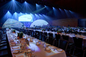
 This past year, Fireworks has conceptualized and designed some innovative event treatments for their clients that incorporate the use of ‘Transformit™ fabric architecture. Transformit™ structures are large stretched fabric architectural shapes that are lightweight, easily transported, easy to rig, and offer extremely cost effective solutions for stage sets, space definition, and decor. The fabric is stretched over an aluminum frame in a variety of shapes and provides the perfect surface for lighting and video projection.
 As a Canadian dealer for Transformit™, Loungeworks has incorporated these structures into a variety of show designs and interior spaces. Fireworks/Loungeworks has engaged us to provide the audiovisual solution to many of their events that include projecting graphics, imagery, and video onto these free-flowing surfaces.
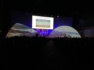
 Last year Destination BC was looking for a fresh new approach for their annual update to British Columbia’s tourism industry. They turned to Fireworks Marketing Group to create a stunning stage design that used Transformit™ as a way to deliver an immersive experience intended to communicate, augment and accentuate Destination BC’s message and brand.
In partnership with Fireworks, we developed all of the multimedia graphics and formatted Destination BC’s scenic imagery to project onto the Transformit™ surfaces. We incorporated a Mac with a triple head video card fed to our Christie 15K projectors through our Christie Spyder video processor. The result was a stunning and unique look that created a high level of audience engagement.
We are proud to have been asked by Fireworks Marketing Group to be a part of this exciting project.
This is the third and final segment of our blog series on preparing for a video interview. This segment will provide some useful tips on the interview process and how to respond to questions.
People are often nervous about being interviewed on camera. It is important to remember that the types of interviews we conduct are for some kind of informational video, whether it be for marketing, internal communications, training, etc. In this type of interview, you are not on the hot seat! It is the director’s job to make you look as good as possible so you will always have the opportunity to do a re-take if you are not happy with your answer.
I find that interview subjects often ask for a list of questions ahead of time. I am reluctant to provide the questions because I don’t want the person being interviewed to rehearse their answers. At the same time, I know if I were to be interviewed I would want to prepare. What I usually do is provide the interviewee with a list of questions similar to what I will be asking but not exactly what I will be asking and not in the same order. This allows the interviewee to prepare and to feel more comfortable going into the interview but ensures the answers remain spontaneous. I have also had clients who have written the questions and answers for their staff members who are going to be interviewed and requested the answers be on a teleprompter. Nothing looks worse on camera and I have never seen anyone read answers and make it look natural. This is a practice that should always be avoided.
Going into the interview there are a few basic things to know. An on-camera interview is not a natural interaction like having a conversation. It should appear conversational but there are some real differences. Except for in very special circumstances, you will be looking at the interviewer and not at the camera. Always hold your look toward the interviewer and avoid making eye contact with the camera. You may have seen an interview where the subject doesn’t know where to look so they shift their eyes back and forth between the interviewer and the camera. This never looks good and makes the person being interviewed appear shifty and unfocused.
In most cases, the interviewer’s questions will never be heard in the finished video. This requires the interviewee to respond in a way that allows the statement to stand on its own without hearing the question. For example, if the question is: “How long has your company been in business? The response shouldn’t be…”7 years”. The proper response for a video interview would be, “Direct Impact Media has been in business for 7 years”. That way the video editor has a complete thought that can be used and cut together with other responses. When you finish your answer continue to hold your look to the interviewer and don’t look to camera. People will often look to the cameraperson for approval but the editor needs you to hold your gaze for at least a second once you have completed your answer.
It is also important for the interviewee and the interviewer not to speak over one another. Wait until the interviewer has finished speaking before responding. If the interviewer is experienced they won’t speak over you. If they want to provide feedback you will often see them nodding their head without saying anything. This provides feedback to the interview subject while avoiding crosstalk, which will often make the answer unusable.
When answering questions it is best if you can speak in sound bites. Answers that ramble on are hard to use and require lots of editing. Answers that are 20-30 seconds in length are best. Most people feel like they need to say too much so practice ending your thought. Often people will give a great response to a question but they never conclude their thought. As the interviewer, I often ask the person I am interviewing to give me a condensed version of their answer. That helps get the main points while keeping the response succinct.
Another technique I use is to ask the same question in a variety of ways. Getting different answers to the same question gives the editor choices when piecing it all together. If you are being interviewed and the interviewer asks you a very similar question in a different way just answer the question and understand that this is a technique. Do not say things like “as I said…”. The final video will probably only use a few clips from your interview so the viewer will never know that you are repeating yourself.
The main thing is to relax, be sincere, and smile at the person you are talking to. Try to forget the camera is there. I find people relax after a few minutes and usually, the interviewer will ask you a couple of throw away questions just to give you a chance to get in the groove. If you are finding it difficult, your camera crew will usually help you through the process.
Thanks for reading this series of blog posts and I hope it provides some useful advice for the next time you appear on camera. Please let us know if this series has been helpful.


